Best Recent Data Visualizations Not to Miss — DataViz Weekly
June 20th, 2025 by AnyChart Team The human brain processes visual information more readily than raw numbers. That makes data visualization a particularly effective way to uncover insights. DataViz Weekly presents some of the best recent examples we have come across:
- Public lands for sale in the United States — The Wilderness Society
- Future flight turbulence under warming — The Washington Post
- U.S. federal finances — Reuters
- Winners of the Information is Beautiful Awards — Data Visualization Society
- Categories: Data Visualization Weekly
- No Comments »
Data Visualization Power on Display — DataViz Weekly
June 6th, 2025 by AnyChart Team Here we are with a new selection of great examples showing the power of data visualization in action, whether for exploring or explaining. See which projects made it to this edition of DataViz Weekly:
- Flight delays and cancellations in Northern California — San Francisco Chronicle
- Real-time UK temperature tracker — Dan Harris and Ed Hawkins
- Threats to whale migration — Blue Corridors Initiative
- Maha Kumbh Mela crowds in petals — Reuters
- Categories: Data Visualization Weekly
- No Comments »
Notable New Visual Data Projects to See — DataViz Weekly
May 30th, 2025 by AnyChart Team Hey data visualization lovers, ready for a new dose of inspiration? Welcome back to DataViz Weekly, where we spotlight the most interesting new projects in which charts and maps help make sense of data visually. Take a look at what stood out to us this time around:
- Ukraine’s energy crisis revealed by city lights — Bloomberg
- Far-right electoral growth across Europe — elDiario.es
- U.S. guns for Mexican cartels — The Conversation
- History of Lubartów’s Jewish population — WeDoData
- Categories: Data Visualization Weekly
- No Comments »
When Data Becomes Visual Insight — DataViz Weekly
May 23rd, 2025 by AnyChart Team Seeing data is not the same as understanding it — that is where visualization makes the difference. This edition of DataViz Weekly features fresh examples showing how insight emerges when numbers are presented thoughtfully. Whether you work with data or just follow it, here’re four new projects we thought you wouldn’t want to miss:
- Aviation incidents in America — CNN
- County population across the United States — Kyle Walker
- Cuts in U.S. science funding — The Upshot
- Measles vaccination impact — Our World in Data
- Categories: Data Visualization Weekly
- No Comments »
New Visual Data Stories Worth Checking Out — DataViz Weekly
May 16th, 2025 by AnyChart Team Qlik Connect was a blast — catch some highlights on our LinkedIn if you’re interested. With all that whirlwind now behind, we’re completely back in the flow of our Friday tradition with a new edition of DataViz Weekly. As always, it is all about sharing great projects that show how visualization lets data talk and sparks insight. Today, we bring you four new visual data stories to check out:
- Visual guide to papal election — Atlo
- Chance of death on birthday — The Pudding
- Sinking ground in U.S. cities — The Washington Post
- Chinese products in American homes — The New York Times
- Categories: Data Visualization Weekly
- No Comments »
Compelling Fresh Visualization Picks for Inspiration — DataViz Weekly
May 9th, 2025 by AnyChart Team We skipped a few Fridays — but for good reason. With Qlik Connect just around the corner, we have been deep in prep mode: finalizing assets, polishing demos, and getting our brand-new Spreadsheets extension for Qlik Sense completely ready to launch. Still, we could not hold off any longer, so we carved out a quick break to bring you a new edition of DataViz Weekly! Here are the most compelling visualizations we have come across lately — take a look:
- Marine migration pathways — MiCO
- Spain’s energy system under strain — Colpisa
- Lawsuits against Trump’s executive orders — Bloomberg
- Met Gala outfit silhouettes over time — Reuters
- Categories: Data Visualization Weekly
- No Comments »
New Impressive Examples of How Data Visualization Works in Practice — DataViz Weekly
April 11th, 2025 by AnyChart Team New week, new visualizations that deserve your look! DataViz Weekly brings together several strong new examples demonstrating how data visualization works in practice — making patterns visible, comparisons clearer, and context easier to understand.
- S&P 500 drops and recoveries over time — FlowingData
- Herd immunity thresholds in disease outbreaks — The Upshot
- Renewable energy targets in the Mediterranean — Ember
- Red Sea under Houthi attacks — International Crisis Group
- Categories: Data Visualization Weekly
- No Comments »
Politics Across New Data Visualizations — DataViz Weekly
April 4th, 2025 by AnyChart Team Politics shapes the world in many ways — and, as always, data visualization helps make sense of it all. This time in DataViz Weekly, we are looking at how charts and maps reflect political shifts, decisions, and consequences — from election results and government budgets to tariff policies and even time zones.
One of these projects is ours. We hesitated for a moment — but let’s be honest, we would have featured it anyway if we had stumbled upon it elsewhere.
So, without further ado, here are the four new data visualization projects we think you’ll want to check out:
- U.S. presidential elections — AnyChart
- Trump tariffs timeline — The Washington Post
- Science funding cuts in the United States — SCIMaP
- Politics of time zones — The Economist
- Categories: Data Visualization Weekly
- No Comments »
Fresh Visualizations Giving Data Voice — DataViz Weekly
March 21st, 2025 by AnyChart Team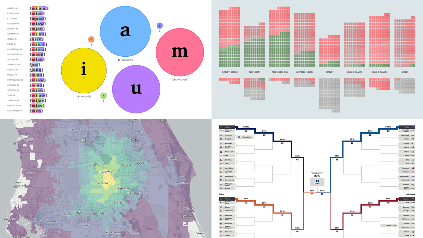 Data can speak — when we let it. Visualization is how we give it a voice. That is what DataViz Weekly is here for: to present real projects showing how data can be expressed through thoughtful visual work. In this edition, we’ve picked four new ones worth your attention:
- Animal sounds across languages — The Pudding
- March Madness 2025 bracket projections — The Athletic
- AI search citation failures — Columbia Journalism Review
- Travel times from any U.S. location — OpenTimes
- Categories: Data Visualization Weekly
- No Comments »
Notable Recent Visuals That Bring Data to Life — DataViz Weekly
March 14th, 2025 by AnyChart Team Data has its own language, but humans? We’re wired for visuals. Charts and maps serve as translators, turning raw numbers into something we can instantly grasp. Welcome to DataViz Weekly, where we bring forward compelling visual graphics that bring data to life! Here are the latest we’re glad to feature:
- Looking back at the COVID-19 pandemic — Scientific American
- COVID’s impact in 30 charts — The Upshot
- Prisoner release risk assessment in Spain — Civio
- Settlement sizes in the Donbas region — NZZ
- Categories: Data Visualization Weekly
- No Comments »